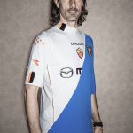
Blood on Blood, a unique way to put together art and football
We chatted with Floor Wesseling to know more about one of the most interesting concept in circulation
May 29th, 2017
The one of Blood on Blood is a unique project, that has no references of a rival in any other mix of football and arts. In shorts: it consists in some mash-up of rivals or opponents teams. But is really difficult to understand it properly. For this reason, we chatted with its founder, Floor Wesseling, in order to know more about it.
Hi Floor, thanks for your time. First of all I’d like to ask you: how did you get the idea?
I started this project back in 2004. A year earlier received a book of my grandfathers which was a manual on heraldry. This ‘forgotten’ visual language with strict graphic rules was the inspiration and starting point of cutting football shirts. I believe that - as a fan and football player - football jerseys are made of fabric with the highest cultural value. They are wearable flags. They are like the modern tunics displaying the colors and coat of arms of the bearer, the players and supporters being the knights and soldiers of today. Combining the jerseys would then be like ‘marshalling’ (the art of arranging several coat of arms in one shield). It shows reliances, cultural relations, brotherhood, rivalry etc. Modern and historical relations between countries, cities, neighborhoods, people.
This project and experiment called Blood in Blood out started as an art project about identity and was displayed at exhibitions throughout Europe and published as a book in 2010. The result was the reaction of the public, lovers and haters, wanting more and especially a request of people with parents of different descent. We were able to give such a person its true blood and identity as one shirt. Next to that we make ‘career shirts’ showing a particular players legacy. And we still exhibit the more ‘historical’ or rivalry shirts, currently as a tour through Europe at city museums. We are now hosted in Luige, Belgium.

How did you deal with the “identity issue” involving for example rival teams? Have you ever “feared” that somebody could feel offended?
I never feared it, because those shirts are intently made. For every exhibition we like to make a local shirt and a lot of times this certain shirt gets banned for security reasons. We now we make ‘unwearable’ shirts sometimes. Especially the combos of big rivals like Barca-Real, Fla-Flu, Manu-Liverpool or Ajax-Feyenoord for example. We do receive nasty threads of supporters sometimes, when we almost forget what we display at a venue. But our sincere reply regarding the rivalry is: “Who would your club be without the existence of its main opponent?” Who would Milan be without Inter? Or Ajax without Feyenoord? Isn’t your main rival part of your identity?
Which team do you support?
AFC Ajax.

What is the process through which you made your creations?
People either ask us for a certain combo or we come up with an idea ourselves. Sometimes they provide us the shirts, even very old ones, most of the time we purchase them. Then the creation process starts. It depends on either the shirt will be worn or exhibited on how we deal with sizing for instance but regarding the design process we start sketching on paper. In the early days we followed the rules of heraldry quite strictly. Rough cuts and disregarding any shirt designs or applications. Lately, especially if we make a design for a person, we look at the existing shirts we like to combine as well as the content and try to create a bit more wearable design. We know people frame them and we like the freaky stuff, but we also appreciate if people really wear them, play football in them. Most of the shirts are handed to the ‘client’ with a photoshoot. The shirts needs to work on the photo as well.
Which is the results you’re most proud of?
Many designs for certain people like for Ronaldinho, Delvecchio or the Pope, but older cultural work as well, like some ‘gyronny’ designs like Portugal - Brazil or a Manchester United - City in a Gyronny-cut. Difficult starlike 8 parted combinations. And a simple classic Holland-Germany I love too which I make quite often, or Milan - Inter because I love the club colors of both and the combo enhances that. Or the first one I had made of real football shirts (not the cheap market fake ones): England-Ireland, in beautiful red and green. There are so many.

Which are the brands that fitted the most together?
It depends more on the cut of the shirts itself as well as the construction and the fabric used on a particular shirt. I’ve made a Italy - Juventus one time (Puma - Nike) with collars and they fit perfectly. But other combinations of different shirts of the same teams could be a disaster. The best statement of combining different brands would be Nike - adidas or adidas - Puma.
One last question: do you have any project you can anticipate us?
I just started a collection on historical designs using football shirts displaying my ideas on “orangists”, people supporting Willem van Oranje during the 16th century and later. Willem van Oranje being our King’s ancestor, supposedly the man who brought independence to Holland and the surname that makes the Dutch wear orange. It is a test using the colors black / white / orange in different shapes and making football shirts from scratch. We are also working on some women’s football jerseys, some ‘formation’-team jerseys and new players career jerseys. And we are working on a new website for Blood in Blood out. which should be released in June. The current website bloodinbloodout.nl is outdated. It only shows the project until 2011.


.png)


.jpg)


