Top 10 of the Europa League 2018-2019 jerseys
Maybe Europa League jerseys are better than Europa League
September 20th, 2018
There are only a few hours left until the start of the Europa League 2018/2019. 48 teams from all over Europe are ready again this year to fight for winning the trophy, but we all know that nobody will watch it for this reason. One of the few qualties of the EL is that it shows off lots of crazy jerseys, more or less extravagant. Waiting for the beginning of the second European club competition, let's see who won the best-looking team award.
# 10 Rangers, Away jersey - Hummel
The Scots return to Europe after the failed attempt last season and they do it in style, presenting three very good jerseys produced by Hummel. What I take into consideration today is the away shirt, white and divided transversely by two stripes blue and red, two colors typical of the historic Glasgow club returned to the top after years of hell due to its failure in 2012. The kit is completed by blue shorts and white socks. Simple and effective.
# 9 RB Leipzig, Home Jersey - Nike
The most hated club in Germany returns to the Europa League after the elimination suffered in quarterfinals of the last season and does so with a gritty uniform for the home matches the hot Red Bull Arena. The Roten Bullen debut in the competition with a humble jersey, colored in white but characterized by two flames that start from the shoulders and cross both sleeves. This year the Germans don't want to make mistakes, and they make it clear immediately with this shirt. Enemies alerted.
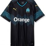
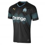
# 8 Olympique Marseille, Away jersey - PUMA
After the débâcle in last year's final, the French return to the Europa League with some respectable jerseys. The second in particular is very beautiful, black with shades of blue in the middle, where geometry reigns supreme in this case, and, more nuanced, on the sleeves. The substantial innovation of this season is that the partnership with adidas has ended and now on the right of the jersey appears the PUMA logo, gilded on this shirt.
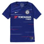
#7 Chelsea, Home Jersey - Nike
The last time the Blues played the Europa League, they won it, managing to conquer both the above-mentioned and the Champions League in just one calendar year. After the disappointing fifth place in last year Premier League, the team now coached by Maurizio Sarri returns to the EL with much ambitions. In the same way, the home jersey designed by Nike is determined and self-confident. Distinguished by the usual bright blue, the jersey presents spurts of white and red horizontally, these able to give a strong sense of uniqueness to the kit that Hazard and his companions will wear when they cross the green lawn of Stamford Bridge during the season. The traditional shorts to match the t-shirt and white socks complete it all.
# 6 Bordeaux, Away jersey - PUMA
Second French club of this special ranking. Bordeaux will not be the most feared team among forty-eight, yet every year it's able to offer considerable style lessons with kits that aren't too flashy. In this case, the Marines away jersey is the one that stands out most. On the white of the background, in the centre of the latter stands a perfectly symmetrical lavender V line from which a total of four thin vertical stripes of the same tone start. The color also goes on the sleeves, completely invaded by this soft and pleasant shade of purple, exception made by an another vertical strip of dark blue. The sponsor's black breaks very well in this very underrated shirt, also signed PUMA as for Marseille.
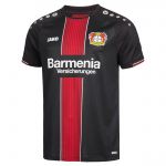
# 5 Bayer 04 Leverkusen, Home Jersey - JAKO
The Aspirins will debut tomorrow with Ludogorets away, fierce and confident as ever in a more favorable context than the more fought Champions League where they often have not figured well. For the occasion, the Bayer has changed for this season, finally showing a home jersey worthy, much more courageous than the previous ones. Black and red remain, only the details change. The shirt for home games shows a mighty wide red line in the center on the classic black background, separated only by the sponsor and containing within it many other small red stripes, with two thin white borders at the ends. On the sleeves a repeated motif proposed by JAKO, the manufacturer for the past three years of the Leverkusen club kits. And that's all. Will this be enough to help the Germans to go ahead in the tournament? Of course not, but certainly the second skin of the boys trained by Heiko Hellrich will know how to give support in the hardest moments, reminding the players who really are the Aspirins.
# 4 Villarreal, Third jersey - Joma
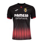
The first third jersey after an endless series of home and away kits is offered by the Submarino Amarillo, which presents an original black third jersey with red stripes that start from the bottom and remain there, not exceeding the sponsor in the middle of the uniform and maintaining a character almost embarrassed as fascinating. Made by Joma, the shirt is quite peculiar, being all you wouldn't ever expect from the Iberian club or from a Spanish club in general that, as we will see later, can be much more creative and particular than that. However, this jersey strikes and remains clear in the mind of the observer, precisely because of its mysterious personality. For me the wooden medal is more than deserved.
# 3 Celtic, Third jersey – New Balance
We are on the podium, a podium that, I confess, will only be formed by third jerseys, as further proof of how the latter are really irresistible for us fashion victims. That of The Bhoys is probably the most bizarre of all. We had already talked about the singular relationship between the second Scottish club (and Glasgow) present in this Top 10 and the black & yellow, but this year's jersey almost surpasses all the others. A psychedelic lime imposes himself to climb on a lesser piece of black fabric on this very strange shirt sponsorized by New Balance, yellow on the sleeves and even on the sponsor. If I had to describe it with a word, I would probably use "incredible".
# 2 Lazio, Third Jersey - Macron
Unique and inimitable ... It was the counterpart of the late 90s. This is just traditional, very beautiful, still trendy but not oversize enough to overcome the ancestor and deserve the first place in this ranking. However, as we understand, this year Lazio looked behind and took from its archives three historical uniforms, above all the second and the third, respectively white and black with the legendary horizontal celestial line to trace the chest and sleeves of the uniform. It's impossible not to be moved by thinking back to the beloved Nedved and Verón, who wore this jersey to brought the Tricolore in the biancoceleste half of Rome almost twenty years ago.
# 1 Real Betis, Third Jersey - Kappa
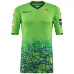
Emotional. Only in this way can we define the Betis' third shirt Betis produced by Kappa for the 2018/2019 season. Pea green, the jersey shows in its lower part a romantic portrait of Seville blue painted, thus illustrating the infinite beauty of the suburbs and monuments (among others, the Giralda, the Torre del Oro) of the Andalusian capital, re-proposing the same concept carried forward much less well by Nike in recent times. The same blue, then, is also on the collar and inserts at the bottom of the sleeves. A daydream to see a legend like Joaquin play with a jersey like this. Nothing to add: the gold medal for the best Europa League 2018/2019 kit goes to Real Betis.


.png)


.jpg)


.jpg)


