
The art of vintage Japanese videogames
Coolness from the past
January 7th, 2019
If you are videogames addicted, perhaps you have already noticed: the graphics of Japanese products "rocks" and we are not just talking about the images of the real games, but also about packaging and commercials. Especially those of the late 90s and early 2000s. An article on the outline reminds us: this particular aesthetic is coming back to influence contemporary artists such as Richard Turley, executive creative director of contents and editorial design for Wieden + Kennedy magazine and man behind the rebranding of Formula 1; the Australian Jonathan Zawada; Cory Schmitz, author of the Oculus Rift rebranding and the Shadow of the Colossus game logo that brought together many of the best examples of the era on his Tumblr QuickQuick.
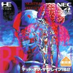
hand-drawn art and lettering, dramatic typography, highly technical layouts, and colorful, sometimes cartoonish patterns,
appeared for the first time around the fourth generation of videogames (from Sega Genesis to the original PlayStation, Sega Saturn or Dreamcast) is gaining more and more space, also due to its contrast with the current trend of clean and minimal Apple style graphics, as confirmed by Schmitz at the site:
As a designer this stuff is super inspirational because it’s so different from current design trends. A lot of unexpected colors, type, and compositions. And I really like the weird sense of nostalgia I get from stuff I haven’t necessarily seen before.
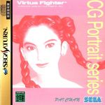
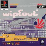
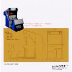
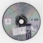
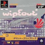
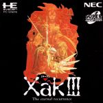
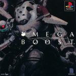
It is not just nostalgia effect. It is love for beauty and attention to detail. Below are a few images of super cool Japanese videogames art.
















.png)


.jpg)


.jpg)


