.png)


.jpg)


All the Serie A 2018-19's fonts
The ultimate guide for font lovers


Sports
February 15th, 2019
February 15th, 2019
Serie A - along with the Bundesliga - has remained the only league to leave creative freedom to clubs and technical sponsors about the design of the fonts on kits.
Premier League, Liga and Ligue 1 all have adopted standardized fonts: it is a choice that makes sense for the graphic identity of a league and that every chance will also take the Serie A in the near future.
In the meantime, however, we can enjoy the graphic diversity of the jerseys of our league: between bold fantasies (like the one designed by Macron for Lazio), thin (like the Atalanta font) or sharpy like FC Inter's.
Let's start, in alphabetical order.
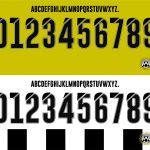
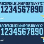
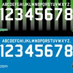
Atalanta - Joma
Bologna - Macron
Cagliari - Macron
Chievo - Givova

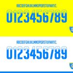
Empoli - Kappa
Fiorentina - Le Coq Sportif

Frosinone - Zeus
Genoa - Lotto

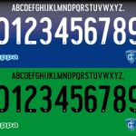
Inter - Nike
Juventus - adidas
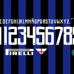
Lazio - Macron
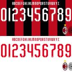
Milan - Puma
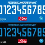
Napoli - Kappa
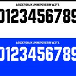
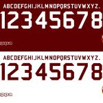
Parma - Erreà
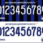
Roma - Nike

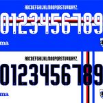
Sampdoria - Joma
Sassuolo - Kappa
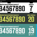
Spal - Macron
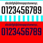
Torino - Kappa
Udinese - Macron