
Torino FC: rebranding operation
A new Toro in the third chapter of the graphic project that redesigns the Serie A teams' crests
March 29th, 2019
Disclaimer: this project was not carried out in collaboration with the Torino Football Club but is the result only of the nss sports imagination.
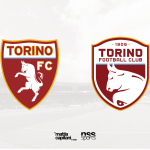
After Sampdoria and Udinese, the one dedicated to Torino FC is the third part of "Operation Rebranding", the nss sports project that refreshes the graphic identity of the Serie A teams. The 'Granata' did not need big changes, but the graphic designer Mattia Capitani has decided to modernize, highlighting them, the most relevant symbols of the Piedmontese club, such as the bull and the garnet color, unique and unmistakable among the teams of Serie A. The club in the last months is proposing itself in the high position of the ranking, demonstrating the value of a project that focuses on an effective mix of experienced, young, Italian and foreign players. The rebranding is intended to be an upgrade of the current Torino FC logo, not a drastic change, which preserves that mythical aura that has enveloped the team since the days of Grande Torino, one of the greatest team of all time and tragically passed on May 4th, 1949, in the Superga accident.
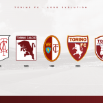
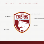
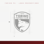
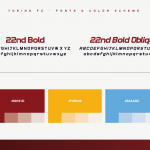
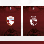
The shape of the shield has undergone numerous revisitations over time, however, the rampant bull appears in the crest since the 40s, in which it was inserted inside a quadrangular shape. During the 90s, those of Mondonico as manager, the emblem was similar to the oval one of the great team of the 40s, evolved only in 2005 in the current one. The composition, although quite essential, does not bring out the individual elements, almost without a pattern positioned within the shield. For this reason, Mattia Capitani has chosen to give a new symmetry to the textual elements, adding the word "Football Club" and the date of foundation to the name of the team. The font has also been renewed, with more soul than the square and static font currently in use. The graphic designer has chosen to maintain the contemporary illustration of the animal, softening some curves and depicting only the upper part of the body. The idea behind the new logo was to add a modern touch to the vintage canons of the current logo.

The garnet color, although irreplaceable, it's slightly darkened in tone, approaching the gradation used in 1983. Many legends circulate about why Torino uses the garnet color, perhaps the color of some 18th century Savoy troops or a tribute to Sheffield United. Surely, however, the first uniform used by the players was with black and orange vertical stripes, Pantone taken by Mattia Capitani, as well as the blue of the city emblem.
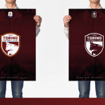
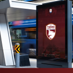
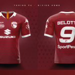
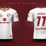
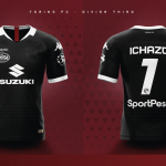
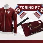
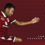
The Turin logo needed more visual power, which put the symbols in the foreground, following a new rhythm without. To clarify the importance of a renewed image, a series of mock-ups were also included within the project. The new logo also has a different impact on merchandising, which uses the official and cleaner version of the crest, with only white lines and the silhouette of the bull emerging from the background with even more decisive. Toro is the Serie A team with most sponsors printed on the jersey (4) who join Kappa's logos on chest and sleeves. Despite a dense design of elements, the new crest manages to maintain its strength and stand out, both in the captain Belotti's home kit, and in Simone Zaza's white away kit.
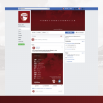
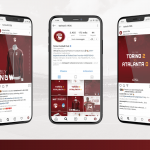
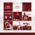
Like many Serie A clubs, Walter Mazzarri's team also focuses on social networks as a means of communicating with its supporters, updating them on the squad results and initiatives. For this reason, the graphic designer tried to redesign the Facebook profile homepage, followed by almost 500 thousand users, but above all the Instagram profile (174k), which is not very attractive and really disorganized.




Disclaimer: this project was not carried out in collaboration with the Torino Football Club but is the result only of the nss sports imagination.


.png)


.jpg)


