
Benevento Calcio: rebranding operation
Helmets, witches and a great desire to see the "Giallorossi" again in Serie A
May 3rd, 2019
Disclaimer: this project was not carried out in collaboration with Benevento Calcio but is the result of the imagination of nss sports .
We have to admit our great secret, the love for Benevento did not end after last season in Serie A. It will have been the first round without victories, interrupted only by the dive of goalkeeper Brignoli against AC Milan, or perhaps the sympathy that we always demonstrate to provincial teams that manage to do big things against major clubs. Fortunately, the Benevento has not lost its hopes and also in the 2018/2019 season it is confirming as one of the strongest of the Italian Serie B, currently fourth in the standings and with a virtually guaranteed place for the playoffs.
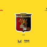
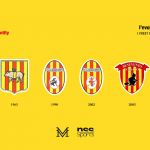
But one thing the Stregoni can complain about: the crest. The team's graphic identity would need a makeover, to make the most of the symbols of a team that celebrates its 90th birthday this season. The festoon at the top does not convince, too much in medieval style, as does the composition, which does not enhance the colors and the white writing, which don't stand out against the yellow and red background.
Lorenzo Manduca has, therefore, put his hand on the crest of the team, for the sixth chapter of the nss sports format “Rebranding Operation”.
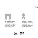
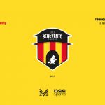
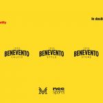
The graphic designer wanted to combine three of the city's major symbols in a single outline, focusing on the pride of the town and its traditions, so little visible in the current emblem. The Arch of Trajan, symbol of Roman origins and one of the most characteristic monuments of the city, merge together, the helmet, symbol of the Battle of 275 BC from which the name Beneventum was born and finally the witch, the oldest of the legends related to the city and present within the crest since the early 90s. The new composition, which follows a rigorous geometric pattern, does not renounce the yellow and red vertical bands but isolates them by a contrasting white and black border, a color that characterizes the whole upper part. Inside this is placed the name of the club and the date of foundation, finally in evidence and more readable, slightly concave and elegant font, as well as more modern and in line with the new rebranding proposals in recent years.
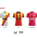
Lorenzo Manduca's project is a real distortion of corporate identity from all points of view, including race uniforms. The Home shirt remains intact in design, to respect one of the symbols most jealously defended by the fans, compared to the white one with red finishes used this season, the Away kit is characterized by two red and yellow diagonal bands that run from left to right while the third jersey abandons the dark tones in favor of a combination of red and pink with white details. In all three proposals of the Frankie Garage suits - here I forgot, another reason why we love Benevento - the witch's profile returns to be the protagonist, fitting into the lower part of the jersey.
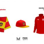
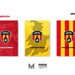
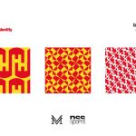
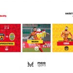
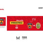
The palette proposals also become the basis for a new social identity, fundamental for establishing a special relationship and closeness with the fans, increasingly curious to find out what happens inside the locker room. The Instagram profile in this sense is the perfect showcase to keep the Giallorossi fans informed about Coda, Viola, Letizia, Insigne, Ricci, Crisetig and all the other Mister Cristian Bucchi players, expected from a season finale that must bring them back on the big stages.











Disclaimer: this project was not carried out in collaboration with Benevento Calcio but is the result of the nss sports imagination.


.png)


.jpg)


