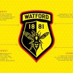
Watford FC has changed its mind about the rebranding
The English club will keep the current logo after the runoff with the winner of the contest
November 21st, 2019
*** UPDATE ***: Six months of process, 4000 designs and about 25000 fans involved. But at the end, however, the English club will keep the current logo, making the rebranding campaign launched last spring vain. It was decided by the final runoff between the old crest (which prevailed with 60% of preferences) and the winning concept of the contest, which seemed to take the place of the London club crest, at 40%.
We have an announcement to make
— Watford Football Club (@WatfordFC) November 20, 2019
In June 2019, Watford announced that they give all fans the opportunity to submit a proposal for the new club logo that will now go head to head with the current one to be used from next season. According to the tweet by Marcus Dilley, founder of DilleyStudio and former adidas graphic designer who took part in the contest, his logo (created with Brian Gundell) could be crest phones by Watford, currently 20th in the Premier League rankings. There is still no official communication from the club, but the announcement of Dilley doesn't leave space for doubts.
UPDATE
— Marcus Dilley (@MDill38) November 7, 2019
I can now officially share that the design created by @bgundell and I created has won!
It will now go head to head with the current crest.
Thanks for all of your support! https://t.co/aaPG7RN6Ty
The submissions were closed in late July 2019 and the final 20 projects were revealed in late September. Dilley's logo won the contest and now it will fight agianst the current one. The crest is characterized by the hornet in the center, which replaces the moose, a symbol debated over the years because of its lack of relevance to the traditions and the nickname of the club ('hornets'). Below the ribbon containing the team name, a shadowing has been inserted to create a second shield which is an updated versione of the 1959 crest. The logo mantains the iconic shape with a modern design, while the typeface - called 'Hornet IPA' -, created for exclusive use by Watford, recalling the typography used by the Benskins Brewery that operated in Watford from 1693.

Watford's initiative is part of a common rebranding process that has recently involved many English clubs (Huddersfield, Hull City, Bristol City and Leeds, even if it eventually remained the same after the fans' protests), who have seen in the crests' modernization a concrete opportunity to revitalize their brand, involving his loyal supporters.


.png)


.jpg)


.webp)
