How the logos of Italian football are changing?
The most successful rebranding cases and club strategies
April 15th, 2020
The word logo is an abbreviation of logotype, Greek welding of the terms λόγος (word) and τύπος (form). In practice, it is the image that defines the way a brand is perceived from the outside. The reification of the identity of a company, starting from letters, forms or images. But in some ways it is also a form of representation of the cultural context to which it belongs. For this reason each logo lives in a process of constant evolution: we must keep up with the times and the renewal of the logo wants to give back to the target precisely this ability to to get perked up.
In an increasingly iconographic world, made up of images that lord over words, it tends to swell with meanings. Today the logo constitutes a conspicuous slice of the branding logics of the big brands. Inevitably, one would say.
Italian football, at least in these terms, seems to have quickly absorbed the need for change. Some logos have only been imperceptibly retouched, others partially modified, others completely redesigned. After all, clubs are to all intents and purposes of companies, and in every large company, beyond the sector of reference, pervasive digitalization and systematic exposure to social platforms have forced the transition from the shamorphism of old logos to the flat design of new ones. By marking the transition from an iconography made of shadows, shades and the search for three-dimensionality to a more essential, clear, flat. It is also true that not everyone can afford a logo that is still almost identical to that of 30/40 years ago, such as those of Manchester United or Bayern Munich, which proudly make a strong point of their glorious tradition.
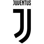
Italy is historically a country linked - if not imprisoned - to its traditions and football is no exception, indeed it perhaps extremes this attitude. For this reason, it is difficult to find in the logos of Italian teams a total disconnection between old and new versions: there is always an anchorage to the past that gives fans back that idea of historicity and sense of belonging that the logo is capable of evoking. On the other hand, the evolution of the style (and not of the essence) of the new logos, especially in the last 15 years or so, is too evident to be unnoticed. The most emblematic case is inevitably that of Juventus, which in 2017 began rebranding starting from a revolutionary logo - created in collaboration with Interbrand, a leading brand consultancy company - not only at the Italian level: no big one had (and has) ever risky so much in this regard.
The J is the symbol of Juventus history: Gianni Agnelli said he was excited as soon as he caught sight of the letter in the headlines of some newspapers; but it is also ideally set in an ancient French shield, a sort of shield, almost to reiterate the idea of a club always devoted to victory. The slogan adopted by the company in presenting the new brand was "Welcome to the future" and Agnelli thus marked that transition: "The new logo defines a sense of belonging and a style that allows us to communicate our way of being. The future for Juventus means growing: growing by winning, growing by communicating and evolving the brand". From this point of view, Juve has traced the road to markets that are lateral to that of football, such as fashion or streetwear, communicating the brand image that is much more universal and transversal.
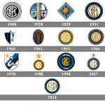
Beyond the particular meanings of the individual elements of the new Juventus logo, the key concept therefore remains the opportunity to grow "by communicating and evolving the brand", a process that the Juventus club has followed by literally crumbling the schemes, but that also other companies have tried to start, starting from the simple touch up of the logo. Between 2007 and 2014, Inter had three different coats of arms, three stages of a slow evolutionary path. The starting point remained the intertwining of the four FCIM letters inscribed in a circular pattern, a road traced by Giorgio Muggiani - creator of the first Nerazzurri logo - back in 1908. In 2007 the star inside the coat of arms was placed outside, the writing ' 'Inter' and '1908' eliminated, the central area enlarged, the colors opaque. In 2014, further compositional simplification was entrusted to Leftolt, with the revisiting of the four letters and the reduction of the concentric circles. A harmonization of proportions aimed at seeking greater readability and reproducibility. Today, looking at the Nerazzurri social networks, there seems to be a further step towards an even more extreme essentiality of the logo, not too far from that of Juventus.
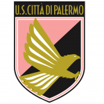
In general, the guidelines for change are those of flat design: cleanliness, linearity and clarity. The objective is recognisability, but not only: in the context of a broader vision, the simplifying reinterpretation of the logo is a way of disconnecting from an exclusively football market. Li Muli, creator of the new logo of Palermo, pushes in this direction: "The idea is to make it more eclectic for merchandising also at an international level, for a type of clothing not only sports. It is a different way of seeing a brand, not necessarily connected to football". It is no coincidence that the new Palermo logo, which had to redesign its image this summer, is the essential union of a stylized P with the head of an eagle, which has always been the symbol of the city. A bridge between past and future, made of historical elements revisited in a modern key.
Those of Juventus and Palermo were radical stylistic revolutions and as such they inevitably sparked parts of the fans, especially the more traditionalist ones. Other teams have changed silently, still managing to present themselves in new guises; the two most significant cases are those of Cagliari and Brescia. At Cagliari, the 2015 rebranding was very successful: compositional simplicity, sporty shape and social colors to protect the Quattro Mori, which in a much drier logo acquire even more centrality. "It is a sincere tribute to the link between the region and its greater football expression. We have been attentive to history, but looking to the future" said marketing manager Mario Passetti. Brescia in 2017 dared, with a flat and stylized logo that has only the shape of the old: the acronym BSFC (Brescia Football Club) has taken the place of the word "Brescia Calcio", the old lioness has been replaced by a head decidedly more modern stylized lioness, while the colors were once again opaque. President Cellino considered the old logo to be too static and a bit old-fashioned, the current one has the characteristics of a modern logo, in some ways even close to that of American universities.
There are also those who have changed only a few details in recent years, without distorting too much: Naples and Rome are two examples in this sense. In 2006 Napoli eliminated any writing from the concentric blue band of the logo, applying a slight stylistically slightly anachronistic gradient. At the center as the only reference to the city remains the white N, historically central element in the setting of the blue logo. But the impression is that it remains an incomplete logo, not entirely capable of evoking the identity of the city of Naples. Rome in 2013 touched up something more, looking for a more modern brand identity, however anchored to the structure of the historic logo. The braided acronym ASR has been replaced by the cleaning of the two writings "Rome" and "1927", together with the stylization of the she-wolf (moved just below the border between orange and red). The iconic profile of the crest, the colors and the centrality of the Capitoline Wolf with the twins Romulus and Remus remain. Nothing to do with the essentiality of the historic mock neck by Piero Gratton, but certainly an effective modernization operation contained in the logo.
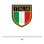
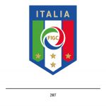
In short, many, practically all, ended up renewing their identity through the modernization of the logo. Drying the internal elements, neutralizing the colors and focusing on shapes rather than words. A projection to the future most often dictated by a reference to the past. The same Italian national team redone the look in 2017, with one of the best-successful new-logos internationally able to combine tradition and novelty. But it is plausible - if not clear - that this is only the principle of a path transversal to the world of football - especially, but not limited to, the Italian one - which is making communication a more decisive factor every day. And the search for minimalism in logos is nothing more than a signal in this direction.


.png)


.jpg)


.jpg)


