.jpg)
How the logos of English football are changing
The most successful rebranding cases and the strategies of the Premier League clubs
June 9th, 2020
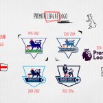
In February 2016, when it came to unveiling the new logo, the Premier League spoke of a new "visual identity" linked to the recognisability of a brand regardless of the sponsor: "From next season we will detach ourselves from the idea of a competition sponsored to make us known only as Premier League, that is the way we intend to introduce ourselves to the rest of the world'' said managing director Richard Masters.
To do this it was necessary to go against the trend compared to what happened in the other main European championships, relying on the creatives of Design Studio who revealed in an interview with Culture Trip that ''the old brand was almost 10 years old and was no longer suitable for the purpose. This is why we decided to create it first of all in a digital version, so that it would almost look like an app icon''. So simple, direct, immediate, recognized and recognizable in this new modernity applied to symbols from the past which represents the challenge for the creatives who must open the doors of the streetwear market to football clubs.
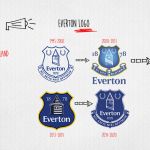
A strategy inspired by the rebranding that various clubs have developed over the years for their logos, especially with regard to minimalism and respect for tradition. Just think that when in May 2013 Everton announced the change of the logo - which would have been without the historic ''Nil satis nisi optimum'' in addition to the two side garlands - over 14,000 fans signed an online petition to oppose it. In the end the choice of the club management was to return to the previous one after just one season, with a logo with an ancient and modern design at the same time, made in two color variations (white and blue): club name and year of foundation moved to the center under the tower of Prince Rupert and restoration of the Latin motto and garlands.
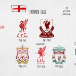
Across the Mersey, in Liverpool, a radical change occurred in the 2017/2018 season, on the occasion of the one hundred and twenty-fifth anniversary of the club's foundation: the iconic Liverbird remains, which gives its name to the team and the city, while the championship is eliminated that surrounded it and the heraldic ribbon in which the foundation date was indicated, now placed on the left of the brand with ''2017'' on the right. A unicum that disappears in the following seasons when you choose to focus on a stylized logo integrated in the design of the shirt, with the initials L.F.C. placed under the Liverbird.
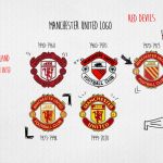
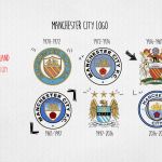
In Manchester, another city split in two, the situation is different. While United, despite the disasters of recent seasons, can still afford to take advantage of the timeless charm of a logo now dated 1998 - a direct derivation of that of 1973, with brighter colors and elimination of the wording ''Football Club'' - the City over the years it has often played, alternating them, with the recurring elements also in the emblem of the city, such as the shield that incorporates a ship, the golden eagle and the pink symbol of the county of Lancashire.
On December 26, 2015, before the match with Sunderland, the current logo was born to meet the needs of the fans, especially as regards coloring and symbolism: the result is a circular emblem, with a white outer band containing the name of the club and the year of foundation, and an interior on a blue background that features a shield with the golden ship and the Lancashire rose. A revised and corrected version of the coat of arms that camped on Citizens shirts from 1972 to 1976.
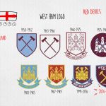
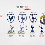
A road, that of the modern reinterpretation of the great classic, followed before and after also by West Ham and Tottenham. For the Hammers, the absence of Boylen Castle is immediately noticeable - following the transfer from the old Boylen Ground to the London Olympic Arena - as a backdrop to the double hammer (with the name of the team placed at the top of the emblem); for the Spurs we have a darker and darker version of the logo already made in 2006, with the rooster resting on a vintage ball.
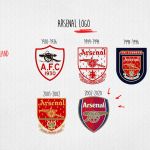
Staying in London, one cannot fail to notice how Arsenal anticipated the times of the revolution: already in 2002 the club decided to opt for a less "cumbersome" design than the previous ones, eliminating the motto "Victoria concordia Crescit'' and changing the direction of the cannon (from left to right) placed in the center of a logo characterized by five colors. This version would have undergone a variation in the 2011/2012 season on the occasion of the celebrations for the 125th anniversary, with the revival of the fifteen oak leaves (a tribute to the founders of the club's history) directly from the 1888 emblem.
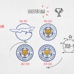
But there are also those who have chosen to change little or nothing. For a Leicester who in 2010 merely enriched the white elements that surrounded the fox placed in the center of the emblem, there is a Newcastle that can boast one of the oldest logos of the current Premier League: it was 1988, in fact, when the Newcastle Magpies decided to go back to the historical heritage of the city, with the black and white coat of arms with golden outlines supported by the two seahorses and topped by the tower with the classic ''royal lion'' placed on the top with the flag bearing the cross of San Giorgio. Instead, the magpie that still today gives the nickname to the darlings of the "Toon Army" has disappeared and that has also been in plain sight on the shirts since 1976.
Because changing, after all, is certainly not a forced choice.


.png)


.jpg)


