How are football jerseys changing?
Trend analysis after the first releases 2020-21
July 1st, 2020
Within two days, two of the sportswear giants such as Nike and Puma have launched the first kits for next season. In rapid succession the home jerseys of Inter Milan, Borussia Dortmund, PSV, Chelsea, the Rangers of Glasgow, Salzburg and Leipzig were launched. Instead, adidas moved slightly in advance, which structured the strategies and the release period of the new uniforms differently. Bayern Munich and Ajax are the only top clubs of the German brand to have already made their debut or revealed with the new shirts. There is, therefore, material to understand in which direction the new soccer jerseys are going and, in stylistic terms, what are the most common trends and directions.
Designing a football shirt is perhaps one of the most complex things for a brand. Being able to combine the rules imposed by FIFA, the stylistic desires of the club and temporal spam in a single large project - the designers are already working to present the mockups for 2021-22 to the teams - which obliges to foresee the designs of the future is a titanic work.
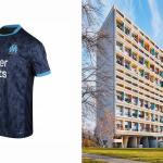
We have identified two macro-trends: the constant reference to the peculiar architecture of a city, as in the case of Marseille - which designs the Cité Radieuse, the first Unité d'Habitation built in Marseille by Le Corbusier - or as in the case of Borussia - the reference to the structure of the Westfalenhalle station is much less visible; the refined use of geometric lines that make the style of a shirt harmonious.
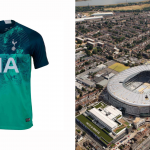
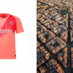
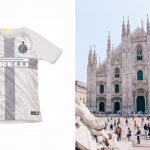
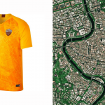
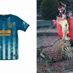
The mix between city art and kits is almost a classic, considering that many examples of the genre had already been seen in the past. All the third Nike jerseys of the 2018-19 season, for example, recall architectural elements of cities such as Barcelona, Milan, Rome, London or Madrid. Inter with the gray-marble shirt that recalls the Duomo, the Barça with the pink shirt on which Avinguda Diagonal is designed, Atletico with the Neptune fountain in Plaza de Cánovas del Castillo, the Tottenham pattern that reveals a view aerial of the district associated with the Spurs of Borough of Haringey and again Rome with the map of the Eternal City. As much as it may be an exclusive, symbolic design with a strong empathic value, it is something already seen.
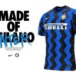
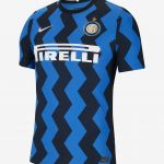
Different reasoning is for those who opt for the second macro-trend, or for those who focus entirely on the sinuosity of the geometric lines. This is the case of Inter Milan, which highlighted the first zigzagging lines of its history with a reference to tribal pop art. This is the case of Ajax, which returns to the past and continues with the geometric flow as per tradition. This is the case of the Feyenoord, which uses strong and thin red lines on the usual black background. This is the case of Porto, which has just released the new kit and does not distort its classic vertical stripes. Also in this case, the references of the past years are many: from Nigeria to Zenit 18-19 and 19-20, from the re-edition of the 1992 Gunners jersey to the 2017-18 kit of Trabzonspor, passing through the Manchester City away shirt that recalls the design of "The Haçienda", a local historian from Madchester in the 90s.
In more strictly stylistic terms, the predominant approach remains that of performance and not streetwear. One of the main signs comes from the choice of bran on the collars. The various experiments (often unsuccessful) of V-collars are definitively set aside, the tendency is to return to the crew-neck collar, an element common to almost all the shirts before the advent of the classic collars.
One of the trait d'union of the new kits for the 2020-21 season concerns the aspect of marketing related to the launch of a shirt. In the past, clubs have always invested heavily in the creation of mostly social content intended to enhance the distinctive features of the new uniform: Skriniar who perforates the marble for the shirt of his Inter, the storytelling of Ian Wright to remember the story there is behind the Arsenal shirt, the Real Madrid led design or the mix between footballers and fans proposed by Chelsea. For the 2020-21 kits, however, no presentation is still noteworthy, perhaps a symptom of a trend that is reversing course. compared to recent years. The only noteworthy case is the presentation built by the Leipzig marketing office, probably also driven by a type of alternative creativity that Red Bull proposes.
Ultimately, for now launches and jerseys have not fully convinced, neither stylistically nor about the brand/club strategies to present them. Many jerseys remain to be seen, hoping that those that arrive will raise the level again.


.png)


.jpg)


.jpeg)


.jpg)
.jpg)


.jpg)


