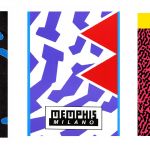
Where did the design of the new Inter shirt come from?
The Memphis collective, Ettore Sottsass and the history of the Nerazzurri zigzag stripes
July 7th, 2020
nss sports
The new Nike home shirt of Inter 2020/2021 has been a cause for debate since the first leaks dated June 2019 in which it was already understood that traditionality would be lacking, which for the Inter fans is represented by the stripes - straight - black and blue.
As we have seen by analyzing the trends of the next season's shirts, the direction taken by the brands is to give architectural and geometric references for the creation of the new kits. The various templates used between 2013 and 2018 will not be repeated soon, replaced by a reference mix that will be used regardless of the graphic and chromatic identity of the teams, instead giving greater importance to themes that can facilitate entry into new markets and to open new communication channels, such as art and design.
Criticizable or not, the questionable choice is not directly attributable to the marketing department of the Milanese team, but it is a decision made by the Nike designers who, given the success of the Nigeria shirt - and related collection - 2018 version, have decided to replicate the format through an approach borrowed from the fashion world.
This is precisely the case of the new Inter shirt (which has a much more impactful effect than the photographs) and of the entire dedicated collection, which for the first time stand out as a cultural element detached from the green rectangle. Taking into consideration the jerseys of the last twenty seasons, we note that there has never been such a clear change: the black and blue lines could vary in thickness and symmetry, but, before this year, the concept has always remained the same. Although the 2020/2021 shirt has no popular references even for the most committed fans, it actually has well-structured Milanese roots that come from the Milanese post-modernist collective ''Memphis''.
The Memphis group (whose logo dates back to 1985 by the hand of Christoph Radl) was founded in 1980 by Ettore Sottsass, architect and designer of Austrian origin, mixing the geometric approach of Art Deco, Pop Art and Kitsch years '50 and it was concretized through projects for furniture, packaging, scenography, fashion and TV with the belief that design should be understood as a means of communication and not as an expression of elitist art.
"Memphis Group created an unusual aesthetic focused on unpredictability and humor in the early 1980s", a description, that of The Vision, which seems to fit perfectly with the crazy zigzag shirt of Inter and for items with abstract motifs from the rest of the collection. It is in fact a series of thematic garments designed to go beyond the concept of reference used to date, with a sure risk assessment - by Nike - of the fact that the shirt will not be ''understood'' at first glance, especially considering that the perception is given by the football public, certainly not famous for having a positive and open approach to changes.
It is for this reason - according to Alberto Mariani aka Rupertgraphic - that leaks would have become a conscious means used by brands to give the user time to internalize a change that would otherwise be difficult to accept overnight. As well as the design of the new Inter shirt: as complicated to accept as it will probably be easy to get used to; a fate similar to that of the Memphis collective, dissolved in 1987 because its members had difficulty sustaining success after the hype had vanished.


.png)


.jpg)


.png)

.jpg)


