Logo evolution: Confederação Brasileira de Futebol
S1E1 - The colors and crests of the history of the Seleção
November 13th, 2020
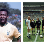
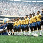
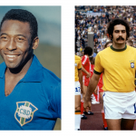
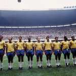
The new kits of the Brazilian national football team are a return to the past, to that 1970 team that won the third World Cup in Rio's history thanks to the management of Zagallo, the goals from Pelé and the magic of Rivelino. A return to the past that Nike has honored with a simple but very detailed jersey, which also makes the Brazilian federation's new crest debut. Changed in 2019 with a rebranding operation entrusted by the Dalton Maag agency, the logo will make its debut on the new Seleção jerseys in the qualifying matches (Saturday 14 and Wednesday 18) for the Qatar 2022 World Cup.
The history of crests is the new focus of the nss sports "Logo evolution" format and it was right to start from the most successful national team of all time and from the only federation that can boast a five-star logo.
1914 - 1917
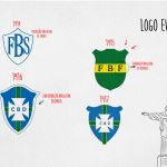
The football federation was founded in 1914 under the name of Federação Brasileira de Sports, with the acronym FBS filling much of the first logo on a white background and with initials and borders in blue. Within 3 years, the federation decided to change its identity several times: from FBS to FBF (Federação Brasileira de Football) before arriving in CBD (Confederação Brasileira de Desportos). The logo also changes shape and colors: from the white-blue of the first to the green-yellow of 1915, passing through the addition of the blue of 1916 and the cruz de malta blanca which makes its official debut in the Seleção crest. The shape will not change radically, with the 1917 version being the more stylized declination of the previous two.
1930 - 1971
The period 1930-1971 is the first winning era of the Carioca: 1958 in Sweden, 1962 in Chile and 1970 in Mexico are the first 3 World Cups they bring home, with a stellar football. Stylistically it's not a very revolutionary parenthesis, on the contrary Brazil begins to become a logo well imprinted in the minds of fans and opponents, as well as becoming a cultural symbol. The only and not so small difference comes in 1971, with the inclusion of the 3 stars at the top of the logo.
1979 - 1991
In 1979 the company moved from Confederação Brasileira de Desportos to Confederação Brasileira de Futbol, returning to the wording of 1916. The change of acronym within the logo did not distort the design, until 1981 when the cruz de malta blanca was removed to make room to the Jules Rimet trophy and a particular bouquet of coffee. This addition, due to a marketing operation, sparked the ire of the fans and forced the then FIFA president Joao Havelange to intervene, asking the CBF to eliminate that detail. Once the bouquet was eliminated, the crest lasted until 1991, when it returned to "normality" with the onset of yellow inside the logo. From 1991 onwards, changes will be minimal.
1994 - 2019
We enter the era of sports marketing and logos become a communication tool as well as identification. Stylization becomes one of the fundamental processes, but the Seleção will not distort its logo for more than 20 years, remaining faithful and applying a slight stylization in 1994 and 2002, years in which the Cariocas take home two other World Cups (USA and Japan -Korea) and thus add two more stars. In 2006 the stylization also leads to a change of color, with the yellow becoming more subdued.
Last year came the latest change in chronological order, with a couple of significant chromatic changes. As for the color, the background blue becomes decidedly brighter, while the yellow and green - colors of the flag - alternate in the opposite way compared to the 2006 crest. A stylistic peculiarity of the last crest lies in the use of stars and the word "Brasil" which since 1981 completes the logo in the lower part. In the emblem used for the match jerseys and Nike items, there will be the 5 stars and the name of the country, while when reference is made to the federation both elements will disappear.
Artwork by Vincenzo Diano for nss sports


.png)


.jpg)


.png)
.png)


.jpg)

.jpg)
.jpg)


.jpg)


