What's behind the aesthetics of Club América
The best designs inspired by Mexican style and Aztec culture
January 22nd, 2021
The design of football jerseys undergoes different influences every year: architecture, history, city symbols and special events. Almost all of them can be traced back to a single macro category, which is the culture of a particular place. Converting a jersey into a cultural symbol is not an easy process, but in Mexico and Mexican football it is easier to combine culture and Fútbol, thanks to the heritage of the Aztec world. The perfect photographs of this dichotomy come from El Tricolor, the Mexican national team, which with the jerseys of USA 94 and France 98 - historic kit with Piedra del Sol, Tenochtitlan and elements of the Aztec calendar - helped to transform a game uniform in an object of cultural value.
From the national team to the Mexican league, the one that today bears the name of Liga BBVA MX. The new stylistic wave comes precisely from the teams of the Primera División de México and in particular one, perhaps the closest to the national team: officially it's Club de Fútbol América, but for everyone it's Club América. The history of the capital's first club begins in 1916, when two teams from two different institutions merge. The name comes under the suggestion of Cheto, born in Pedro Quintanilla. It will be called América because the date of foundation (12 October) coincides with that of the discovery of América in 1492.
The paternity of the colors belongs to Rafael Garza Gutierrez and German Nunez Cortina who stole a yellow, worn and turned cream, and navy blue trousers duly cut at the knee. Because of the colors they become for all the Azulcremas, but the club prefers another nickname: Las Aguilas, the eagles. The cultural value it has on the capital is best summed up by the fans, who still today in the barrios of Mexico City say that "You pronounce Club América but you read el mas grande de Mexico".
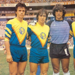
Beyond its historical significance, Club América holds a special place in the aesthetic rankings of world football. FourFourTwo has defined the team's kits as "the most hipsters in football history" and it's impossible to blame them. The last 35 years have been managed by adidas (1984-2000) and Nike (2000-2021) and the productions have never betrayed expectations. The aesthetic revolution begins in 1982, the year in which the iconic V-shaped design appears for the first time, where the chevron is not a simple stylistic element but has a very specific meaning: Vittoria.
The entry of the three stripes is interlocutory, but in 1984, the year in which the brand decided to apply the design that made its debut that same year to the colors of the CA - which in the meantime regain vigor, passing from cream to bright yellow on the shirt of the German national team. The series of yellow, blue and red rhombuses and inverted triangles has a double aesthetic-cultural value: on the one hand it incorporates the most frequent patterns of the gaban, the colored version of the Mexican poncho; on the other hand, fans immediately associate that design with the wings of Club América's eagles.
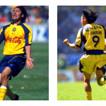
The iconicity of the shirt reaches very high levels, so much so that it is included in the best 50 shirts ever by specialized magazines. All combined with the best known jersey sponsor: Coca Cola. The work of adidas is incredible and revolutionary from certain points of view: in 1993 it reverses the position of sponsor and logo, while in 1999 it inserts the logo in all-over on the shirt, creating an exceptional visual effect. The inverted triangle is still today an invention recognizable by all.
Taking over after a job done so brilliantly is not easy, but Nike manages to raise the bar even more after a difficult transition period. From 2005 onwards, the swoosh has taken up the hipster aesthetic of the club's kits, mixing it with Mexican culture. In 2007 a design was chosen that incorporates the wings of an eagle, reproduced on the left sleeve of the players and goalkeepers. Speaking of goalkeepers, Nike also takes up another Mexican tradition, interrupted with Jorge Campos but never forgotten. Guillermo "Memo" Ochoa, historic goalkeeper for Águilas and the national team, in 2008 worked closely with Nike designers to create a special shirt that incorporates the figures of Atlantis in Tula, which for years have inspired Aztec sculptors in the depiction of warriors. In 2012 he continues his journey into pre-Hispanic aesthetics and the all-over blue print of "CA1916" is another milestone in the Azulcremas style.
2016 is an important year, both for the 100 years of the club and for the 50 years of the Azteca Stadium. For the occasion, the shirt is garnet in honor of Torino, the first opponent in that sacred temple of Club América. The circle closes with the third jerseys of the last two years. In 2019-20 an unusual color was chosen which will be renamed as "Aztec Turquoise", accompanied by the 1994 pattern and by Maquizcohuatl, the two-headed snake symbol of the Aztec empire reproduced on the collar. In 2020-21, however, Nike decided to pay homage to Ochoa, taking up the design of the 2008 shirt: the inspiration was the "Caballero Águila", an almost mystical figure who stands out in the Aztec imagination for charisma and leadership.


.png)


.jpg)


.jpg)
