The history of the Ferrari logo
From the Savoyard cavalry to Maranello, passing through the WW1 military aviation
January 27th, 2021
A rampant black horse on a yellow background: that of Ferrari is the most famous logo in the world. Logo that summarizes the history and identity of Ferrari, whose prestige is almost religiously protected by the Maranello car manufacturer, ready to defend it from anyone who dares to compromise its good name - Philipp Plein included. And much more is concentrated in a logo than the signifier of a brand: the logo itself is an object with a history, which has been stratifying in the collective consciousness for decades and, in the case of Ferrari, even for centuries.
The first appearance of a prancing horse associated with red and speed dates back to 1692, and is found in the coat of arms of the "Piemonte Reale" cavalry regiment founded by Vittorio Amedeo II of Savoy - a symbol destined to remain associated with one of the most formidable cavalry in European history as well as one of the oldest regiments of the Italian army. The prancing horse was then taken up by the best Italian aviator of the First World War, Francesco Baracca, who printed a black one on the cockpit of the 91st Airplane Squadron. Originally the horse was red (a reference to the coat of arms of the Piedmontese knights) but it became black when Baracca died.
In June 1923 Enzo Ferrari, together with Giulio Ramponi, won the first Savio Ferrari circuit in Ravenna driving the Alfa Romeo RL-Targa Florio and met Count Enrìco Baracca, father of the aviator. The image of the horse was "entrusted" to Enzo Ferrari as the winner of the race to carry on the memory of his deceased son. From this meeting a second ensued, with the aviator's mother, of which Enzo Ferrari himself writes in a letter to a friend:
«She told me: “Ferrari, put my son's prancing horse on your cars. It will bring her luck ”[... [I still keep the photograph of Baracca, with the dedication of his parents […] The little horse was and has remained black; I added the canary yellow background which is the color of Modena»
At the time, Enzo Ferrari was both an Alfa Romeo driver and dealer for Emilia Romagna and the Marches and therefore was not authorized to print his own emblem on the cars. In 1929 the Scuderia Ferrari was founded, a sort of racing branch of Alfa Romeo, dedicated to racing cars, and it was necessary to wait until 1932 for the Prancing Horse to appear, for the first time, on the bodywork of two Alfa Romeo 8C 2300 Mille Miglia Zagato. Spiders lined up by the Scuderia at the 24 Hours of Spa in Belgium, inserted in a yellow shield with the initials SF, acronym for Scuderia Ferrari.
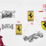
In 1943 the transfer to Maranello took place, where the team was built on land owned by Ferrari himself. In 1945 Ferrari commissioned the Milanese engraver Eligio Gerosa to produce a new design of the horse that included the tail pointing upwards and a slimmer shape of the animal's body. It was also at this stage that the canary yellow color was added in honor of the city of Modena. At the time, the symbol was also used by Fabio Taglioni, who applied it to Ducati motorcycles in the late fifties and early sixties.
In 1947, Enzo Ferrari began building his own cars, independently of Alfa Romeo, and a secondary rectangular logo was created with the founder's surname whose "F" extended to cover the entire word and was touched by the paw of the horse. Already in 1951 this detail disappeared and the horse and the writing separated. At the top of the logo there was a tripartite band with the colors of the Italian flag. A graceful font with many spaces was used which later became the reference for the restyling of the logotype. The latter mark is found on all Ferrari GT and racing cars, while the one with only the shield is found on the cars used in official competitions.
For many decades the brand remained substantially unchanged, consolidating itself in 1994 with the Visual Identity Manual by Pierluigi Cerri which formalized once and for all the salient features of the real logo. This official codification was followed by the restyling of the Seidlcluss agency in 2002 which gave the definitive touch to the logo by optically correcting the silhouette of the horse, the position of its legs and also the rectangular point on the Ferrari "i" - probably the most distinctly different detail than the original shape of the logo.
Today, eighty-one years after its foundation, the history of Ferrari and its logo represent one of the most interesting case studies in the field of graphic design. In addition to symbolizing the prestige of the car manufacturer and the identity of the Ferrari brand, in fact, the Prancing Horse is the most direct demonstration of a cultural heritage which, in its original meanings of speed and daring, has remained substantially identical to itself from its origins until now - moving, depending on the time, to ever new areas.


.png)


.jpg)


.jpg)


