.png)
The rebranding of San Marino National team
And of the whole football Federation
February 8th, 2021
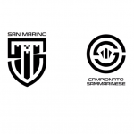
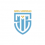
The San Marino national football team has presented on its official website the new logo together with that of the Football Federation, plus other logos for national competitions (the Titan Cup and the San Marino championship). The two new coats of arms are part of the club's new identity brand, developed in collaboration with UEFA GROW, a project of the highest European football body for the growth of sports federations. The new logo is part of the brand identity redevelopment project announced last September, and was designed by the Genoese company VIVO ADV, winner of the call. To celebrate the new identity of San Marino, the Federation has chosen the local feast day of Sant'Agata, a comatrona della Repubblica, as a moment of exaltation of the local tradition.
In addition to wanting to renew the graphic pattern of the National and Federation, San Marino wanted to develop a new identity that can lead to new commercial and marketing possibilities. And he decided to do so following the combination of the continuation of tradition alongside a modern paradigm. In practice, a dialogue between heritage and innovation. The need for a new logo, however, was also born from the need to renew the graphics of the old model, according to the federation's top management incompatible with current commercial needs. So we have moved from the traditional circular logo to more minimalist models, more elegant in the stretch, and that anyway, bear the social colors of the Federation - white and blue, gray and gold, the color of the coat of arms of the Republic. For both logos, VIVO ADV was inspired by the symbols of the Republic of San Marino, Mount Titano and the Three Towers: in the coat of arms of the Federation stands the acronym FSGC intertwined with the date of foundation (all in yellow with figures in blue), while for the national logo a Scudetto shape was chosen with the shapes of the towers imprinted. These two new symbols are united with the logos of the two national tournaments, which share with them the font (which VIVO ADV has taken up from the medieval writing style), elaborated ad hoc for this graphic project and specially named FSGC Official. It is capitalized and alternates sharp and soft strokes.
Andrea Nardoni, Head of Marketing at FSGC, explained that: "Those we launched today and those already presented in September, are registered and actually owned by the Federation: this means being able to count on new opportunities from the marketing and communication side. All this will give the FSGC the ability to have immediately recognizable logos, protected from every point of view, with distinctive features of history and tradition of which we are proud, but able to connect with modern communication channels to get closer to even the youngest groups".


.png)


.jpg)


.png)


