The timeless aesthetics of the New York Metrostars
The style of the 90s in the best jerseys of NYC team
April 22nd, 2021
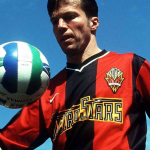
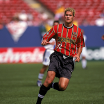
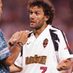
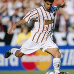
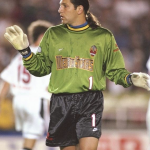
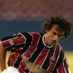
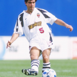
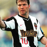
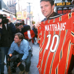
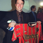
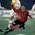
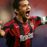
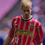
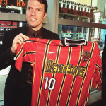
If on the one hand it's impossible to define the history of a team in a few words, on the other hand there is always the exception that confirms the rule. This exception is called Metrostars, the coolest team in MLS in the first decade of the American league's life. The club located in Harrison, New Jersey, and its history can be summed up in a simple sentence: "The best kits, but the worst teams". The results from 1996 to 2006 have never matched the beauty of the jerseys Donadoni, Djorkaeff, Meola and Matthäus have worn over the years. But Metrostars aesthetics is still today a staple in the American football imaginary, setting standards that are still difficult to achieve today. The life of the New York team lasted only 10 years, but it is as if they were 50 for the load of cultural and sporting meanings it generated.
The history
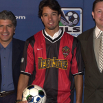
The New Jersey/New York Metrostars were among the founding fathers of Major League Soccer, which officially opened its doors in 1996. The first owners, John Kluge and Stuart Subotnick, chose "Empire Soccer Club" as their name, but soon changed their mind by choosing "Metrostars" as the media company owned by Kluge was called Metromedia. The 1996 team is considered one of the strongest, with Roberto Donadoni and Nicola Caricola as Italians called to illuminate American soccer.
The debut came on April 13, 1996 in Pasadena against the Galaxy, in a Rose Bowl still brand new after USA94. Almost 70,000 people for the first historic day of MLS, a game that looks more like an omen of doom than a party for the Metrostars. If Harrison is still pronounced "The Curse of Caricola" today, everyone knows what it is talking about and the legend begins right from its debut in California. An unfortunate own goal by Caricola - former European champion with Juve in 1984 - is worth the victory of the Galaxy in the opening match and in the first home game of the Metrostars at the Giants Stadium another defeat comes 15 seconds from the end with a other own goal by Caricola. Those two moments are considered by many to be "The Curse of Caricola", the one that will never allow the Metrostars to win an MLS title.
In 1998 the New York vs New Jersey diatribe begins to get heavy and the company decides to eliminate the "localization" from the name. From the third season, therefore, it will be only Metrostars, creating a unicuum in the history of American professional sport. The story ends in 2006, when Red Bull buys the franchise for a little over $ 30 million and takes possession of the culture that fans and players have helped to create in 10 years.
Metrostars aesthetics
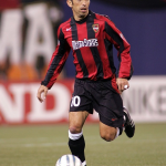
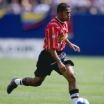
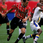
The football aesthetics of the 90s found in the USA World Cup an essential milestone for its evolution and the American teams have contributed to making it special. The Metrostars in '96 chose red and black, with some shadows of orange to complete a unique palette in the MLS scenario of the time.
Without being under the hegemony of a single brand that produces jerseys, MLS teams have often worn incredible jerseys. Brands like Nike and Reebok used MLS as an experimental laboratory and then exported the successful models all over the world and some of these have become legendary. The Metrostars aesthetic encompasses all the frenzy of New York rhythms, an almost electric way of life that characterizes the ever-present logo from '96 to 2006. The templates of the jerseys ride the "electric design" chosen by the company, a style that will make every jersey with the Swoosh that the Metrostars will wear.
Logo Evolution
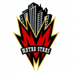
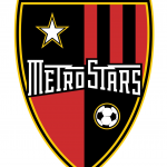
The logo is also part of the overall aesthetic of the NJ franchise, a clear representation of New York in pure 90s style. The "M" is once again electric and follows the trail of the logotype that will act as jersey sponsor, while at the top there is the NY skyline with its skyscrapers. The full text of the team name completes everything, which will remain the only survivor after the change in 2002. 7 years after the foundation, the first rebranding will bring the Metrostars towards a crest closer to the European idea of a logo with a shield divided into 4 sections: in the upper quadrants there is a star (left) and red-black stripes (right), while in the lower ones there is a full red square (left) and another black with the symbol of a balloon (right).
Best kits
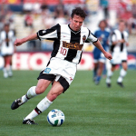
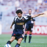
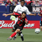
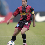
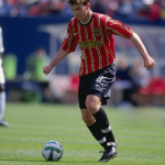
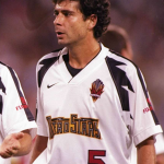
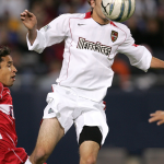
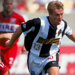
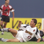
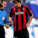
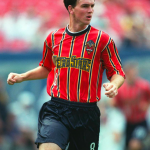
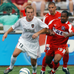
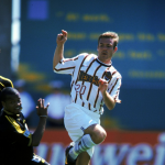
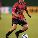
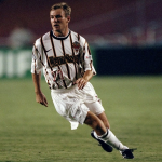
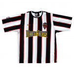
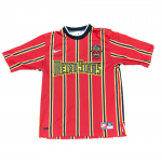
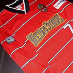
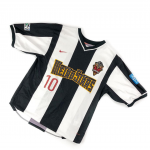
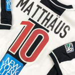
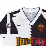
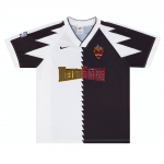
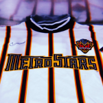
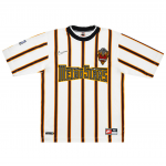
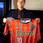
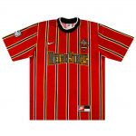
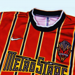
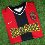
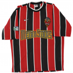
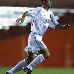
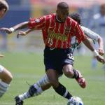
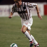
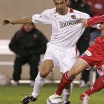
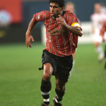
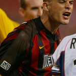
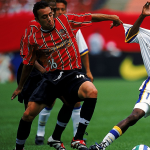
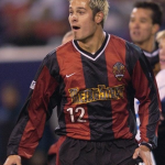
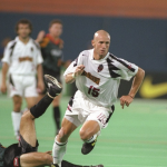
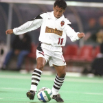
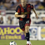
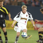
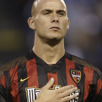
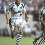
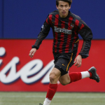
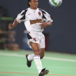
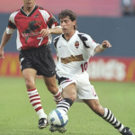
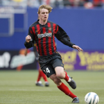
The best business card of the Metrostars are the game jerseys. Nike produced all of the club's jerseys until 2005, giving life to legendary models. The journey begins with the 1996 away version of the inaugural jersey worn by Roberto Donadoni, with a template that enhances the alternation of black and white and that goes perfectly with the electric design of the Metrostars. But it will be the stripes that will characterize the best kits of the team, such as the fabulous home version of 1998 - hands down the best representation of the football aesthetic of the 90s in the USA. But great examples also pass through the innovation of 2005, the latest Metrostars jersey made with the T90 template. In between there are gems of rare beauty: from the white away in 1998 with a harmonious use of orange to the home that Matthaüs will wear in 2000 with 3 unique vertical bands. A special mention deserves the alternative jersey of '96, what ESPN has defined "the infamous Nike template" due to its zigzag design that the San Jose Clash, Los Angeles Galaxy and of course the New York/New Jersey will wear. Metrostars.
The move from Metrostars to New York Red Bulls brought first trophies (2013) and champions (Henry, Marquez, Cahill, Wright-Phillips), but it took away a lot of the aesthetics of the beginnings. In the collection launched by the MLS franchises for the 25th anniversary of its foundation, there is a lot of history and a lot of heritage. Everyone has filmed the glorious days of the inaugural season, except the Red Bulls New York. And it's time to revive the aesthetic heritage of the Metrostars.


.png)


.jpg)


