Serie A has a new logo
The rebranding is there but it is not seen and has not yet been communicated
July 2nd, 2021
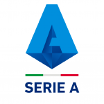
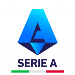
After taking part in Pride Month by coloring the logos of (almost) all social accounts with the rainbow, Serie A returns with a slightly modified logo compared to the previous edition - in force since summer 2019. As in the case of the rebranding of AS Monaco, the change is there but it is visible only to the most attentive and ready eyes. There is still no official communication on the change, but in the last few hours both the social pages and the official Serie A website have been updated.


Compared to the crest of the last two seasons, the new logo of the top championship of Italian football abandons the roundel design and accentuates the colors, making them much brighter and creating a sharper and more decisive contrast. The stylization of the "A" is accentuated, but the new brand identity remains essentially the same. The logo has already been used on social content (posts and stories) and the official status of the League on this new switch is expected. As always, there will be a version with the title sponsor TIM and a version without.
It would be the seventh logo in chronological order from 1997 (the year the Legacalcio was founded) to today, with an evolution that tries to keep up with the times: from the simple ball that symbolizes a universe and a tricolor astral band to the maximum stylization of the " A "the step is not so short. Since 2009, the TIM logo has become an integral part of the Serie A crest.


.png)


.jpg)


