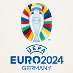
The new 2024 European Championship logo
Although there are still 1000 days to go, here is the new graphic identity of the tournament

October 6th, 2021
Last night at an event in Berlin, UEFA unveiled the new logo for EURO 2024, which will be held in Germany in less than 1,000 days. The tournament's logo is this time derived from the flags of UEFA's 55 member associations and their colours, which are assembled in various combinations, reflecting the shape of the roof of the Olympiastadion. The famous Henri Delaunay Cup features in the centre of the logo, while the 24 coloured slices around the trophy represent the participating national teams. UEFA EURO 2024 will be hosted by Germany, with matches to be played in Berlin, Cologne, Dortmund, Düsseldorf, Frankfurt, Gelsenkirchen, Hamburg, Leipzig, Munich and Stuttgart. The final draw for the tournament will be held in December 2023 in Hamburg.
UEFA has never excelled in graphic taste over the last twenty years, although the logos of international competitions have entered the design books, just think of USA94, Ciao, the mascot of ITALIA 90. The history of the logos of the European Championships is in fact very varied in terms of design, with a downward trajectory: if we want to trace its evolution, we could read it as a story divided into four different acts, which began back in 1960 with an idea by Henri Delaunay. Even the EURO 2024 logo does not contradict this slightly outdated graphic vision, where the cup is still the protagonist and the colour palette is based on the flags of the European countries.


.png)


.jpg)


.png)

