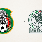
The new logo of the Mexican national team
The seventh logo in the history of the Mexican federation was unveiled yesterday at the Azteca Stadium

December 1st, 2021
Tonight the Mexican Federation announced a new rebranding, the seventh in its history. The logo has been totally revolutionized, from the shape to the eagle, and all textual and graphic references to the "Federación Mexicana de Futbol" and the "Piedra del Sol" have been removed. The only thing that remains is the eagle with the classic ball in a modern, stylised version, made specifically for the 2022 World Cup, which will be played in less than a year in Qatar. The federation wanted to create a logo that looked to the future, far removed from those of the past but still consistent with its history.
The last change to the national team's logo was in 2011, when the federation only decided to change the position of the eagle, positioning the animal's gaze towards the horizon. As was the case with Costa Rica a few days ago, the new logo of the South American national team incorporates both the flag and its colours, mixing tradition and innovation as has happened with other national teams. Looking at the current evolution of logos, from those of car manufacturers to those of national clubs, Mexico's rebranding seemed right and proper, streamlining a silhouette that was far too full of elements.


.png)


.jpg)


