Atalanta and Cremonese show how bad or good Christmas shirts can be made
Two examples less than a hundred kilometers apart but with diametrically opposed results
December 16th, 2021
We are now a week away from Christmas Eve and, while preparations for gifts and dinner are in full swing, even Italian soccer teams are starting to reveal their jerseys dedicated to the festivities. December in fact also means neck warmers, gloves and colored balls visible above the snowy fields of the Christmas Match. A tradition that also in Italy is gaining ground on the model of the Premier League's Boxing Day and that deserves to be celebrated with a specific jersey. It's just that, from an aesthetic point of view, it's not easy to make soccer jerseys that incorporate the symbolism and colors of Christmas.
Red is already too heavy and complex to digest, and green tends to blend in with the playing surface. Then there are the reindeer, fir trees and all the other knick-knacks that we usually associate with Christmas but not with a football game. So how do you make a Christmas soccer jersey? This year two teams separated by less than 100 kilometers and a few series have released almost simultaneously two jerseys, one of which has been a great success and another that has been widely criticized to the point of forcing the technical sponsor to intervene through the press. We are obviously talking about the Cremonese and Atalanta jerseys. For both of them to create a jersey to celebrate the Christmas holidays is now a custom since every year both try their hand at this venture, but the results are very different.
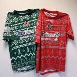
Cremonese has chosen a theme that recalls the warmth and family spirit of this period, with a design inspired by the typical and questionable ugly sweater, which has become a custom in Christmas merchandising. The colors chosen for the jerseys can only be gray and red, while for those of the goalkeepers the choice has fallen on green. An imaginative jersey design and aggressive colors that still won over the public, going sold out in a few hours. It is not so much the choice of colors or symbols that works as much as the strategy, Cremonese in fact every year, unlike Atalanta, offers different templates from the previous ones and also away from the usual jerseys used in the league.
The Christmas match made last year has in fact recorded the same success. In that case, however, the Piedmontese company together with Acerbis had not inserted any Christmas element, dusting instead off two historical colors of the city, white and lilac. A move that turned out to be a winner, distinguishing itself once again from Atalanta that last year had created a simple grey jersey with the classic Christmas tree closed inside the logo, something very close to those pajamas that we usually receive as a gift from our aunt.
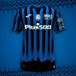
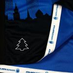
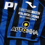
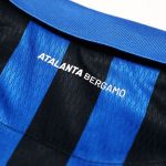
Atalanta, for its part, this year together with Joma has slightly modified its home uniform by adding in the lower part of the jersey the city skyline and the usual stylized tree, an element that is now a permanent feature of the Dea's Christmas jerseys. However, the Spanish brand made a very serious mistake: it inserted a skyline that does not seem to be that of the upper city of Bergamo. An error first pointed out by fans in various social comments and then spread among the various newspapers, which have pointed out that the silhouette of the shirt looks more like Turin, the team of which Joma is always a sponsor. The buildings of the medieval city, surrounded by ramparts erected in the 16th century, do not correspond to those of Città Alta, but instead to a perfect representation of the Mole of Turin and the surrounding buildings.
Beyond the offending skyline, what stands out is a certain monotony: for the fourth year in a row, the use of the stylized tree denotes a lack of imagination or at least a fear of daring. If, from a sporting point of view, Atalanta has been a novelty in the last few years, imposing itself in the top areas of the ranking, on the contrary, from a stylistic point of view, the team from Bergamo has never shone. And yet, important names such as Nike have passed through Bergamo, but they have not been able to leave the classic schemes behind, never changing the image of a club that has remained too anchored in its tradition.
As said moving inside the colors and symbols of Christmas is never simple, and Atlanta has given us a punctual demonstration of it. Although in the years the kits have multiplied, we cannot afford to lower the creativity and the attention to the detail or otherwise we risk mistakes to which it becomes impossible to remedy. It is also difficult to find a link between soccer and the Christmas holidays. In Italy, traditionally, all leagues, unless there are special needs, have always stopped, putting all their activities on pause. Cremonese in fact opted for a ruffian design, which plays with one of the greatest contemporary icons of Christmas. That's why it got a very positive response, despite the fact that the jersey itself does not take into account the tradition of the club and becomes more of a marketing object than a real game jersey. Even at Christmas, therefore, despite the fact that we are all better, the jerseys remain a very useful indicator to understand what are the main fluctuations in the branding of the teams. Now we just have to wait for new jerseys dedicated to the holidays.


.png)


.jpg)


