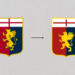
Genoa has changed its logo
A revolution that will also involve the technical sponsor

June 15th, 2022
Having archived the disappointment of relegation to Serie B, Genoa today presented the new brand identity that will accompany the Grifoni from next season. The changes are not conspicuous, the red-blue shield with the cross of St. George on top and a 'new' grifone in the middle, more 'minimal' with the tail pointing upwards and slightly smaller in proportions than the old one. It is not an epoch-making change, designed to streamline the logo and make it even more modern and functional for online communication, but nevertheless maintains the close link with the history and colours of Italy's oldest club.
Not only the new logo, according to various rumours 777 Partners and its president Zangrillo want to keep faith with the words spoken at the presentation press conference: 'a change must be made, in the environment and in corporate management.' And this change will in fact also touch the technical sponsor, according to several rumours the red-blue team will terminate the contract with Kappa to sign with Castore. This is also quite an important change, with the English brand finally landing in Italy and having its first opportunity to establish itself as in its home country.


.png)


.jpg)


