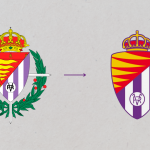
Real Valladolid has changed its logo
The team owned by Ronaldo broke all ties with tradition and the fans did not take it very well

June 20th, 2022
Despite the fact that the championships are over and the players are on the most exotic islands to recharge their batteries in anticipation of the new season, all the talk in Spain is of Real Valladolid's new rebranding. The team owned by Ronaldo, after their promotion to the Primera Division thanks to their second place in the regular season, decided not to update their visual identity but to overhaul it, changing most of the elements that have always distinguished the team from the city of Valladolid. The new logo has not really cut all ties with history and tradition, as fans have been complaining these days, but is a simplification of the one designed in 1928. In fact, the logo has been designed in a modern key and, compared to the previous one, the graduated cross of St Ferdinand and the laurel wreath have disappeared.
"Respecting the essence and promoting what will be was the premise that guided this change. The new identity stems from this glance at the past in order to project itself into the future. The new coat of arms is inspired by that of 1928 and reinforces the key elements of the Club: colours, flames and crown." A change and an ideal historical moment, that of the summer of promotion to La Liga, in which the dream of the beginning of the season became real, and a widespread happiness is still in the air."
Whether the new crest is the result of a three-year study process carried out together with FutureBrand, the result was not as well received as Ronaldo had expected. Indeed, the enthusiasm for the promotion seems to have stopped for a moment in the Spanish town because of this logo, despite the efforts made. We will see if the results and the football market will be able to overshadow this rebranding, which was not exactly well received.


.png)


.jpg)


