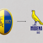
Modena Fc has changed logo
A stylised canary will replace the historic coat of arms

June 22nd, 2022
"For us, flying is not a dream, but a necessity", with these words this morning the Rivetti family, owners of Modena Fc, presented the new logo that will take the place of the historic coat of arms. No restyling or revamped versions, away with the shield and monogram that will make room for the stylised canary that will appear on Modena's jerseys, website and every item, a symbol that has always been part of the club's history and that was conceived to be recognised throughout the world. The bird in question, with its yellow plumage, is the team's most iconic symbol, and it is precisely because of it that the club's players are associated with the nickname canarini. The font of the logo, as Rivetti stated during the press conference, was instead taken from Modena Flash, a local newspaper from the 1960s.
"It is a return to the future because the canary has always been part of the club's history, all the fans recognise it, and taking up the image of the canary in the world and in the world of football is an added value for the club and Modena fc. We have not invented anything, only that from today the canary becomes the protagonist. In a digital era it goes better with all devices, chromatically the gold has been removed to make it look better. It will be on the shirts from next season and will remain; it will not be combined with the old logo."
A counter-trend choice that of the Rivetti family, which contrasts with the corporatisation put in place by teams in recent years in an increasingly schematic manner, following the same rigid borders that define the new crests. A rebranding that also arrived on the occasion of promotion to Serie B and that will not be limited only to the logo, the ownership is in fact also working on the website and all the assets to give Modena a new coordinated image, up to the standards of the new category in which it will play.


.png)


.jpg)


