The best jerseys with a city map on it
When geography and football meet to celebrate identity and attachment to local teams
June 27th, 2022
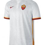
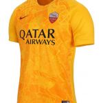
Until a few years ago, one of the most prominent trends in football shirts was architecture and symbols that make cities different and unique. Graphic references and sources of visual inspiration have been and still are essential to create kit that can have an impact on merchandising, a positive spin on branding and to cement the relationship between city and club more and more. The start of it all was in 2017 when Nike designed the uniforms for the 2018-19 season and for the first time one of the predominant motifs became urbanism. On the third jerseys of Barcelona, Roma and Tottenham the swoosh chooses to pay homage to the urban elements that characterise the metropolis of reference such as Avinguda Diagonal, the Borough of Haringey area and the map of the Eternal City.
A trend that has evolved over the years, declining in various ways, as PUMA did in 2020 with AC Milan when it created a pattern that recalled the design of the pavement of Milan's Galleria Vittorio Emanuele II, one of the most iconic elements of the city centre. Or again when the Beaverton-based brand intersected architecture with the iconic materials that make it universal: the homage to the marble of Milan Cathedral on Inter's third jersey was unforgettable. A trend that has never completely gone away, however, as we saw with the Kappa jerseys of Venezia this year and that seems to be timidly returning again this year with the new away jersey of Barcelona, where Nike re-proposed the design thought up for Roma in 2015 and then in 2018. For this reason we have created a collection of the best jerseys that best intersect and enhance the relationship between city and team, bringing the most iconic streets, squares and monuments to the playing field.
AIK Fotboll
One of the most iconic was made just this year, again by Nike, who to celebrate AIK's 131st anniversary in an unprecedented dark royal blue, never before used in official AIK jerseys, placed a map of Stockholm on the chest, to once again certify the relationship between the team and the city, playing with colour tones. The gold details further embellish the jersey and give it the sense of opulence and solemnity that we associate with the royal court.
Genoa and Naples
Like Nike, Kappa has always tried to convey territoriality and a sense of belonging on its jerseys, and there are two concrete and most successful examples in its history, those involving Genoa and Napoli. "Into cheu du Zena", was the slogan designed last season to present Genoa's new jersey to the city. A jersey as simple as ever, divided into the traditional red and blue quarters, embellished with the tone-on-tone map of the Ligurian city. Similarly, in 2019, to celebrate and thank the affection of the Neapolitan fans, Kappa has created the 'Napoli District'. A fourth jersey obviously dedicated to the city and featuring two shades of grey, black inserts with the map of the 30 districts of the capital of Campania.
Santos and Le Coq Sportif

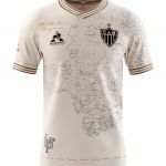
Outside the borders of Italy, football and architecture have met thanks to Le Coq Sportif also in Brazil in the new Santos jersey. As happened with the Kappa and Nike jerseys, the French brand has placed the map of the city on the front of the jersey to celebrate the 113th anniversary year. This one is more special than the others, not because of the design or choice of colours, but because it was made by a fan thanks to the contest launched by the team together with the French brand.
Jako and Joma
From Jako to Joma, the substance does not change. In addition to the brands already mentioned, the German and Spanish brands also decided to put the city map on the St Gallen and Hibernian jerseys. Both very similar and made in green, the former focuses on the large headland and hill systems that characterise the Swiss town. The second, on the other hand, captures the very streets of Edinburgh, exactly those of the city district of Leith where the team was founded.


.png)


.jpg)


