.png)
Behind the scenes of Genoa's rebranding
The agency Blossom told us the details of the creative process of the new red-blue logo and more
June 30th, 2022
New logos and rebranding in general have always had the power to divide and split fan opinion. In fact, it is complex to try to translate into symbols the new language that the club seeks to launch, trying to trace a path of growth that starts from afar, distorting the present to project into the future or, on the contrary, remaining anchored to the past, taking as its inspiration everything that has been adopted over time. Today, the logo is no longer the functional aesthetic object useful for identification, but over time it has become one of the clubs' most important and expendable assets. Somehow it has become a form of representation of the cultural context of which it is a part. For this reason, every logo lives in a process of constant evolution, where, in order to stay in step with the times, renewal becomes almost obligatory to try and broaden its target audience.
Italian football, at least in these terms, seems to have quickly absorbed the need for change. Some logos have been only imperceptibly retouched, others partially modified, others completely rethought. After all, clubs are to all intents and purposes companies, and in every large company, regardless of its sector, pervasive digitalisation and systematic exposure to social platforms have forced the transition of old logos to the flat design of new ones. One of the most recent rebrandings was that of Genoa, which restructured its logo without distorting it. The agency Blossom took care of it, and in an interview - Giacomo Frigerio co-founder of Blossom, creative director Simone Pessina and content writer Arianna Losi - told us the background of the entire creative process.
Did Blossom want to work in football or did she end up there by chance?
No we actually didn't think we would end up in football. We started working with Samp and Milan, we worked on several season ticket campaigns, when they were still just simple posters. Then came Bologna with whom we have been collaborating for seven years, we created a bit of everything, from the stadium to the slogan. At last came Genoa and now we have something planned with Torino as well. It was all random, let's say, we work with many other companies.
Club logos are no longer just functional aesthetic objects, useful only for identification. Over time, updating one's visual identity has become fundamental, the logo is one of the most important and expendable assets of clubs. What in your opinion distinguishes a functional and successful logo from an outdated one?
You have to evaluate case by case, there are clubs that have a great historicity and this must be preserved in some way, but without remaining too anchored. The case of Genoa sums it up perfectly, it's something we have struggled with a lot, managing to find something that manages to maintain a modern and contemporary aesthetic impact without distorting the soul, it was a lot of work. We did a lot of testing to arrive at the final result. To answer more straightforwardly, I tell you, there is definitely a need for an update in some cases, for a different cleanliness, there are cases and cases. You have to be able to interpret what the club needs and intervene on the fundamental part. You have to change while trying to maintain what are the fundamental values, certain assets and aesthetic elements that are an integral part of the club without distorting it. Restyling is useful as long as it is consistent with the needs.
The communication of brands and clubs in general is increasingly taking place on digital platforms, a logo that is too complex, too rich in realistic visual effects and gradients loses distinctiveness, do you think it is now essential to aim for minimalism?
There is a move towards minimalism, more towards the digital world. Today we are used to seeing everything online, everything social, so a logo has to live in its minimum size and at the same time remain distinguishable. There is a different focus now. We also see it in the automotive world, everyone has changed with this in mind. Another silly example is that if team logos used to be very colourful, today it is not impossible to see even something monochrome. To do something like this, you have to have a logo that can be synthesised in any form.
Since the dawn of organised football, teams have always included shapes, colours and elements in their coats of arms that strengthened the relationship between the club and the city or place of origin. Today, however, it seems quite the opposite, how much have the logos changed compared to the past?
They have changed as football itself has changed. All logos stand in time, every rebranding doesn't come by chance, if you look at the Inter logo from the 80s, it will remind you of the influences of that period, it's normal. Every logo marks a timeline, very few teams keep the same logo as when they were founded. Juventus for example has distorted its origin, what was in the past, is one of the most glaring cases. There is a dutiful phase of updating in order to remain timeless, with a link to the past always defined and clear. The task is undoubtedly to be able to interpret where the club wants to go, where the market is going and arrive at a common will.
You always have to consider the context in which you live, Juventus has a global audience, it is not confined only to Turin, while Genoa is more representative of a people, a square. Here there is a strong bond with the city, even just the name of Genoa where we find the word Cricket in it is unique enough in itself, difficult to find in other teams. It's their own thing, to twist everything Juve-style would have been wrong because we would have put aside the heritage of Genoa.
How difficult was the restyling for Italy's oldest club?
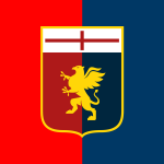
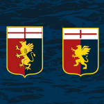
It wasn't difficult, it was super challenging. We tried to come up with a logo that managed to maintain what was special about it, without distorting it, and that was perfect for the digital world. What we did was to essentialise the shapes, we reduced the pennant, raised the tip and rounded the shape of the Griffin. We took the cross on top off the edges to improve readability. The griffin was the element that took us the most time, we put the legs back the way they were supposed to be and rebuilt a proud head, a more swollen chest and then above all the wings. Before, you could only see one of them, now you can see both. In short, it took us a long time, we concentrated a lot on coming up with a symbol that could represent the griffin in a correct way. To do this we looked at a lot of references, we saw Brescia, which worked in a very similar way with its lion. We wanted the Grifone to become a recognisable symbol, capable of conveying the tenacity and pride that characterises the team.
Everything started from a very deep reasoning, we started from a positioning concept trying to understand how the team wanted to position itself in today's world. Genoa is the oldest club in Italy but the need was to speak to the new generations. I think that's the challenge of every club, to maintain this balance between the fans and the faithful and the new generations that need to be involved. So the first question was, if we talk to the new fans, how much will they recognise themselves in the new logo? In my opinion the challenge is to find a balance between these two aspects, recognisability and innovation. We started with the positioning and then developed the visual identity together with the poster, which was drawn up on the basis of the values they told us during the brief and on the basis of this we thought about how Genoa could speak from now on. We wanted to tell the story but also project the team into the future so as not to keep it anchored in the past.
It was a long job, which started last year with the work done on social media, the logo has been ready for a long time in fact. We worked with Preziosi and then the discourse continued with 777 Partners. One example would be the coach, a crazy communication object in this sport, designed with sea references, the colour dark blue, there we made sure the logo could be replaced. Now we've applied it to the stadium, we've seen it in the social media and also in the new technical material and it fits really well, it impacts in a different way.
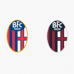
In the case of Bologna, on the other hand, how did you manage to renew the visual identity of the club without betraying its values and at the same time innovating and adapting its language?
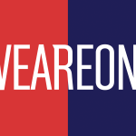
About Bologna there are so many stories to tell, so many journeys on the A1, there it was a long job, super demanding. The first year we changed the whole stadium in one summer, the whole visual language, identity, commercial proposals, website. But especially the font, the challenge was to bring an immediate and positive impact on a team rooted in the territory that represents the entire city as opposed to Genoa. The claim we came up with, given also the arrival of Saputo, with 'We are One', in line with what the city represents for the team and vice versa. This was what the president wanted to communicate also considering the crucial moment of the season, the new ownership, the possible promotion to Serie A, this claim represented a sort of crossroads, also sporting. We managed to create a new shared language, from the fans to the club. For the first year we also planned a translated version of 'We are One' in Bolognese.
Are changing logos, in your opinion, changing football?
If we talk about beauty, aesthetics in general, on Sundays, on TV at the stadium in the newspaper, I say that there is a normal evolution, daughter of our time. In my opinion it is not changing it, but it is showing that a team becomes something else and manages to interact, attract and involve more and more people. That football has changed is for sure, talking to many insiders there is a positive tension just from the presence at the stadium. People are returning to populate the stadiums and design in this can help reposition it completely. However there is a need for change, as we have said, a profound change that starts from the club to change its approach and broaden its horizons.


.png)


.jpg)


.png)


.png)
