It is the year of patterns for Macron
From Serie A to the Premier League, the Italian brand opted for all-over prints
September 16th, 2022
If there is one brand that in recent years has managed to steal ground from the big sportswear giants this is certainly Macron. It is not only thanks to the designs and patterns created for the shirts or having signed an agreement with UEFA by dressing the referees of European competitions, the particularity of the Emilia-based brand's roster is the type of teams: most are medium or small clubs that cannot aspire to an elite contract with a big brand but neither do they want to settle for a basic supply. And so Macron has taken advantage of this void left by other brands such as Nike and adidas, two brands that have decided to invest less and less in the Italian league and that sponsor only one team each in Serie A, to increasingly broaden their base.
Following this strategy, also this season the Bologna-born brand has confirmed itself as one of the brands that has managed to best combine innovation and tradition in a football shirt. Every year, in fact, technical sponsors try to find a design that can innovate the style of the jersey without making it lose the identity and tradition of the corporate colours, and Macron for the current season has found it with its patterns by introducing all-over prints to create movement and give the kit additional vitality. Thus, the creativity of the brand this year, despite being varied due to the high number of clubs served, has particularly focused on patterns by presenting shirts with a graphic print in most cases derived from the club's coat of arms or elements of the city or simply plays of colour as in the case of Bologna, Verona, Spal, Nottingham, Blackburn and Basel.
Bologna - Monogram
As mentioned, the touch that defines the jersey is given by the all-over graphics, both on the front and on the sleeves, which recall a monogram with the use of the acronym BFC, taken from the club logo, printed in relief. On the chest, in silicone print, there is the Macron logo on the right and the Bologna Fc 1909 logo on the left. A very strong trend in Serie A, also present on the shirts of Roma and Napoli.
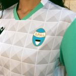
Spal - Palazzo dei Diamanti
After having created the first jersey on which, with a tone-on-tone print, the famous acronym S.P.A.L. is repeated, Macron and the Emilian club have presented the new away kit inspired by one of the symbols of the city of Ferrara: the Palazzo dei Diamanti. A jersey that alternates white and grey in the pursuit of a three-dimensional effect thanks to its tone-on-tone graphics created to replicate the effect of the rustication that gives the palace its name.
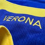
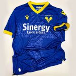
Verona - A dedication to the city
In this case, the major novelty of the kit is the large cross that dominates the entire front of the jersey and recalls the city banner of the city of Verona. On this jersey the cross is represented by the two mighty mastiffs that already make up the club's logo, here proposed in relief printed graphics, tone on tone and repeated.
Basilea - Back to the past
Nottingham Forrest - Trent Bridge
Unique and classic style for Nottingham Forest's home shirt for the 2022/23 season. Here, too, the homage is to the city thanks to the tone-on-tone pattern on the sleeves and sides that refers to the Trent Bridge, one of the symbols of Nottingham. A return to the Premier League in style for the English team, famous for securing two Champions Leagues in the 1980s.


.png)


.jpg)


