The new PUMA shirt of the Slavia Prague 2020/2021 A pattern created by mixing two architectural references from the Czech capital
As we have analyzed in recent weeks, several brands have focused on architectural or geometric references to create the designs of the shirts for next season.
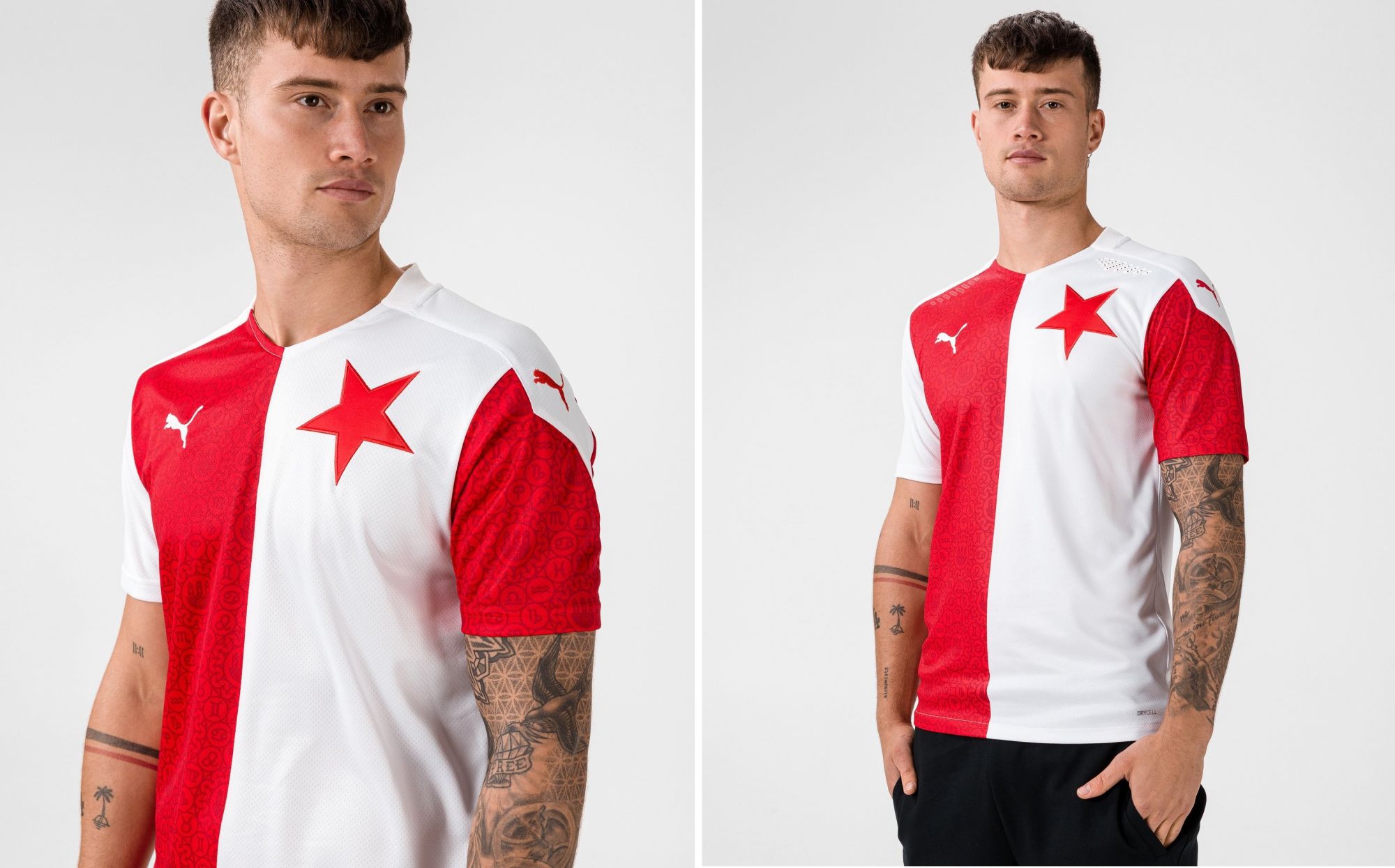
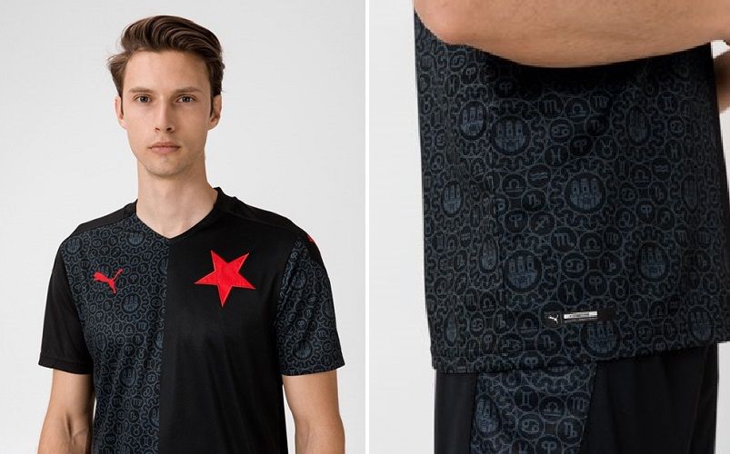
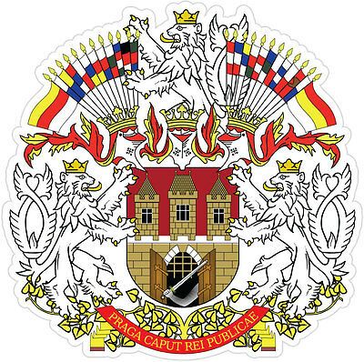
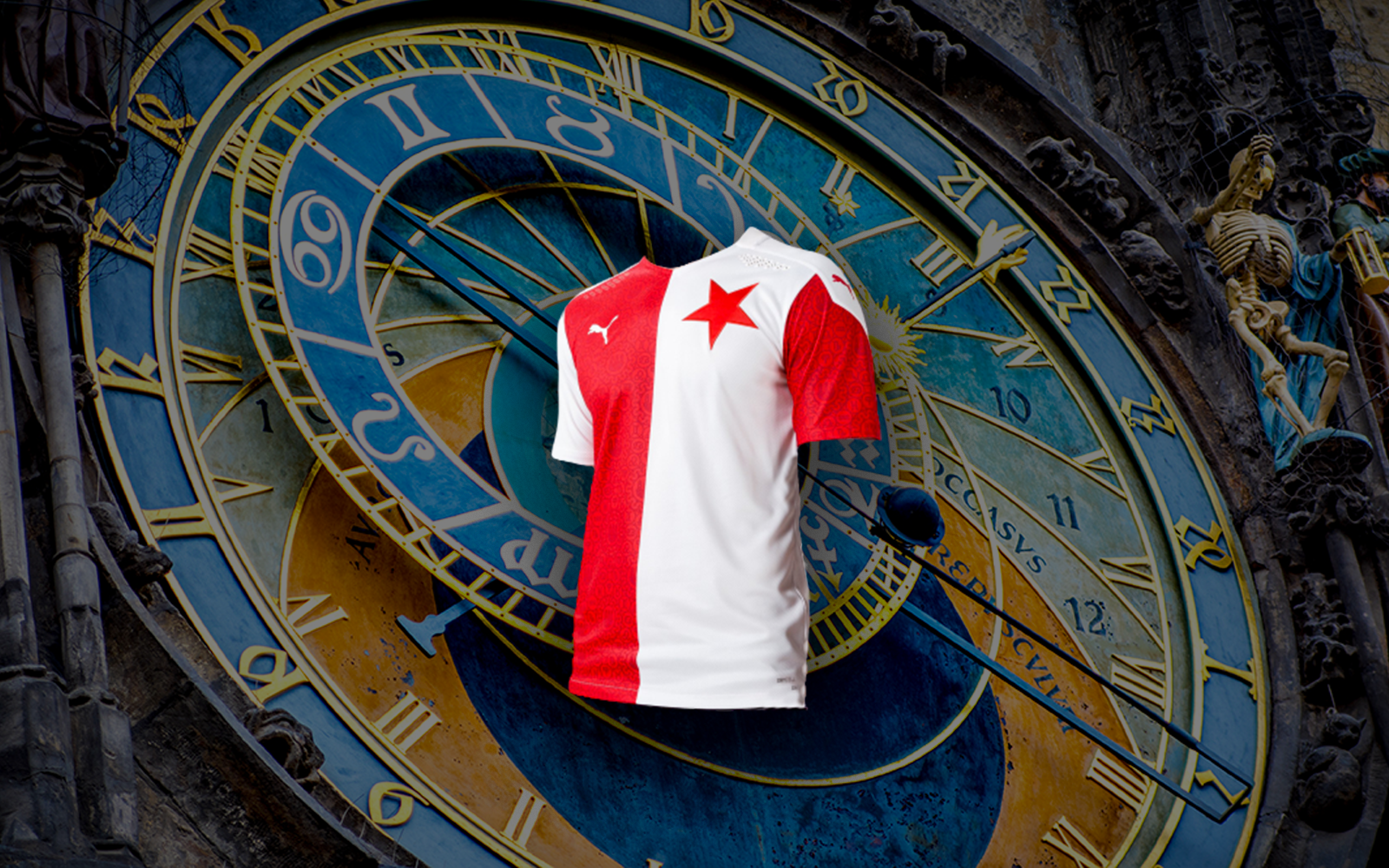
After PSV Ehindoven and Borussia Dortmund, PUMA has decided to follow the same type of reference also for the new Slavia Prague jerseys, which have a pattern linked to the medieval origins of the Czech capital and to its architecture; the texture, which is repeated in both the home and away shirts, is in fact a mix of two different elements: the heraldic coat of arms of Prague and the zodiac signs.
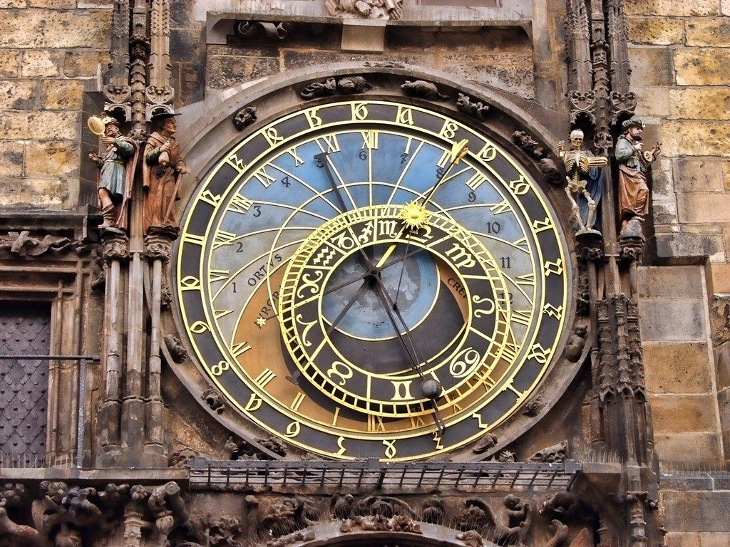
The first is an allegorical derivation of the coat of arms of the city of Prague, which in the PUMA version has been simplified and stylized; the zodiacal signs instead refer to the Astronomical Clock in Old Town Square, consisting of three "levels": the "Procession of the Apostles", the "Calendar" and the "Astronomical Quadrant" which indicates just the zodiacal period of the year and from which most of the elements that formed the definitive pattern were taken.
The home shirt, as usual white and red with alternating sleeves, is decorated with this complicated design in the two red parts and is completed with the club crest on the right side, a red star, and with the PUMA logo on the left.
The away shirt is the copy of the first shirt but declined on two shades of black: in the lighter part the pattern is repeated while in the darker part the monochromaticity remains; the star and the logo of the technical sponsor remain in red.


